Calculating in situ diversification and historical dispersal
Intro_calc_insitu_dispersal.RmdThis article will show some metrics calculated at assemblage level
implemented in Herodotools package. Specifically, we will
calculate metrics that are proxies for in situ diversification,
historical dispersal and colonization age of assemblages. For this we
will use distribution data of genus Akodon.
Briefly, we will perform the following steps:
- Process raw species occurrence data and phylogenetic information
- Calculate metrics of in situ diversification, assemblage colonization age, and the proportion of species in a region resulting from historical dispersal among regions.
Reading data and libraries
First, let’s read libraries we will use to explore the data and produce the figures. If you do not have the packages already installed, they will be installed using the following code.
libs <- c("ape", "picante", "dplyr", "tidyr", "purrr",
          "raster", "terra", "ggplot2", "stringr",
          "here", "sf", "rnaturalearth", "rcartocolor", "patchwork")
if (!requireNamespace(libs, quietly = TRUE)){
    install.packages(libs)
  }
There are two packages that are not in CRAN (daee and BioGeoBEARS) and are required to run the analysis in this vignette. We suggest installing and reading these packages from Github using the following code:
if (!requireNamespace(c("daee","BioGeoBEARS"), quietly = TRUE)){
  devtools::install_github("vanderleidebastiani/daee")
  devtools::install_github("nmatzke/BioGeoBEARS")
}
library(daee)
library(BioGeoBEARS)
Now we need to read the files corresponding to the distribution of species in assemblages of 1x1 cell degrees, and phylogenetic relationship that will be used in downstream analysis with Herodotools
library(Herodotools)
data("akodon_sites")
data("akodon_newick")
Data processing
Here we will perform a few data processing in order to get spatial and occurrence information
site_xy <- akodon_sites %>%
  dplyr::select(LONG, LAT)

akodon_pa <- akodon_sites %>%
  dplyr::select(-LONG, -LAT)
Checking if species names between occurrence matrix and phylogenetic tree are matching
Exploring spatial patterns
Here we plot richness pattern for Akodon genus. For this we will use the ggplot2 package to produce some maps
library(ggplot2)
coastline <- rnaturalearth::ne_coastline(returnclass = "sf")
map_limits <- list(
  x = c(-95, -30),
  y = c(-55, 12)
)

richness <- rowSums(akodon_pa_tree)

map_richness <-
dplyr::bind_cols(site_xy, richness = richness) %>%
  ggplot2::ggplot() +
  ggplot2::geom_raster(ggplot2::aes(x = LONG, y = LAT, fill = richness)) +
  rcartocolor::scale_fill_carto_c(name = "Richness", type = "quantitative", palette = "SunsetDark") +
  ggplot2::geom_sf(data = coastline) +
  ggplot2::coord_sf(xlim = map_limits$x, ylim = map_limits$y) +
  ggplot2::ggtitle("") +
  ggplot2::xlab("Longitude") +
  ggplot2::ylab("Latitude") +
  ggplot2::labs(fill = "Richness") +
  ggplot2::theme_bw() +
  ggplot2::theme(
        plot.margin = unit(c(0.1, 0.1, 0.1, 0.1), "mm"),
        legend.text = element_text(size = 12),
        axis.text = element_text(size = 7),
        axis.title.x = element_text(size = 11),
        axis.title.y = element_text(size = 11)
        )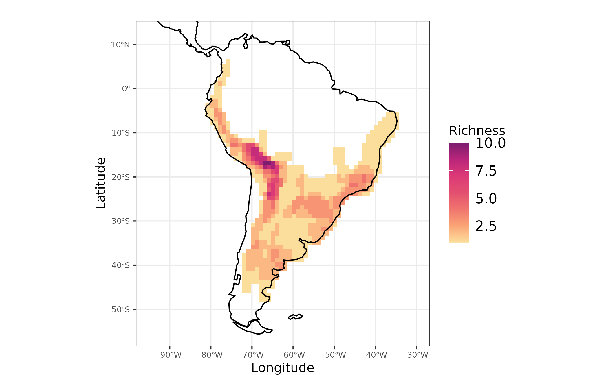
Figure 1 - Species richness for Akodon genus in South America
Reading classification from evoregion analysis
To facilitate the demonstration, we will use a pre-computed classification from evoregion analysis.
We have to transform the evoregion results to spatial object in order to visualize in a map the regions. This can be done using the following code:
data("site_region") # pre computation evoregions
evoregion_df <- data.frame(
  site_xy,
  site_region
)

r_evoregion <- terra::rast(evoregion_df)

# Converting evoregion to a spatial polygon data frame, so it can be plotted
sf_evoregion <- terra::as.polygons(r_evoregion) %>%
  sf::st_as_sf()


# Downloading coastline continents and croping to keep only South America
coastline <- rnaturalearth::ne_coastline(returnclass = "sf")
map_limits <- list(
  x = c(-95, -30),
  y = c(-55, 12)
)

# Assigning the same projection to both spatial objects
sf::st_crs(sf_evoregion) <- sf::st_crs(coastline)

# Colours to plot evoregions
col_five_hues <- c(
  "#3d291a",
  "#a9344f",
  "#578a5b",
  "#83a6c4",
  "#fcc573"
)
Evoregions can be mapped using the following code
map_evoregion <-
  evoregion_df %>%
  ggplot2::ggplot() +
  ggplot2::geom_raster(ggplot2::aes(x = LONG, y = LAT, fill = site_region)) +
  ggplot2::scale_fill_manual(
    name = "",
    labels = LETTERS[1:5],
    values = rev(col_five_hues)
  ) +
  ggplot2::geom_sf(data = coastline) +
  ggplot2::geom_sf(
    data = sf_evoregion,
    color = "#040400",
    fill = NA,
    size = 0.2) +
  ggplot2::coord_sf(xlim = map_limits$x, ylim = map_limits$y) +
  ggplot2::ggtitle("") +
  ggplot2::theme_bw() +
  ggplot2::xlab("Longitude") +
  ggplot2::ylab("Latitude") +
  ggplot2::theme(
        legend.position = "bottom",
        plot.margin = unit(c(0.1, 0.1, 0.1, 0.1), "mm"),
        legend.text = element_text(size = 12),
        axis.text = element_text(size = 7),
        axis.title.x = element_text(size = 11),
        axis.title.y = element_text(size = 11)
        )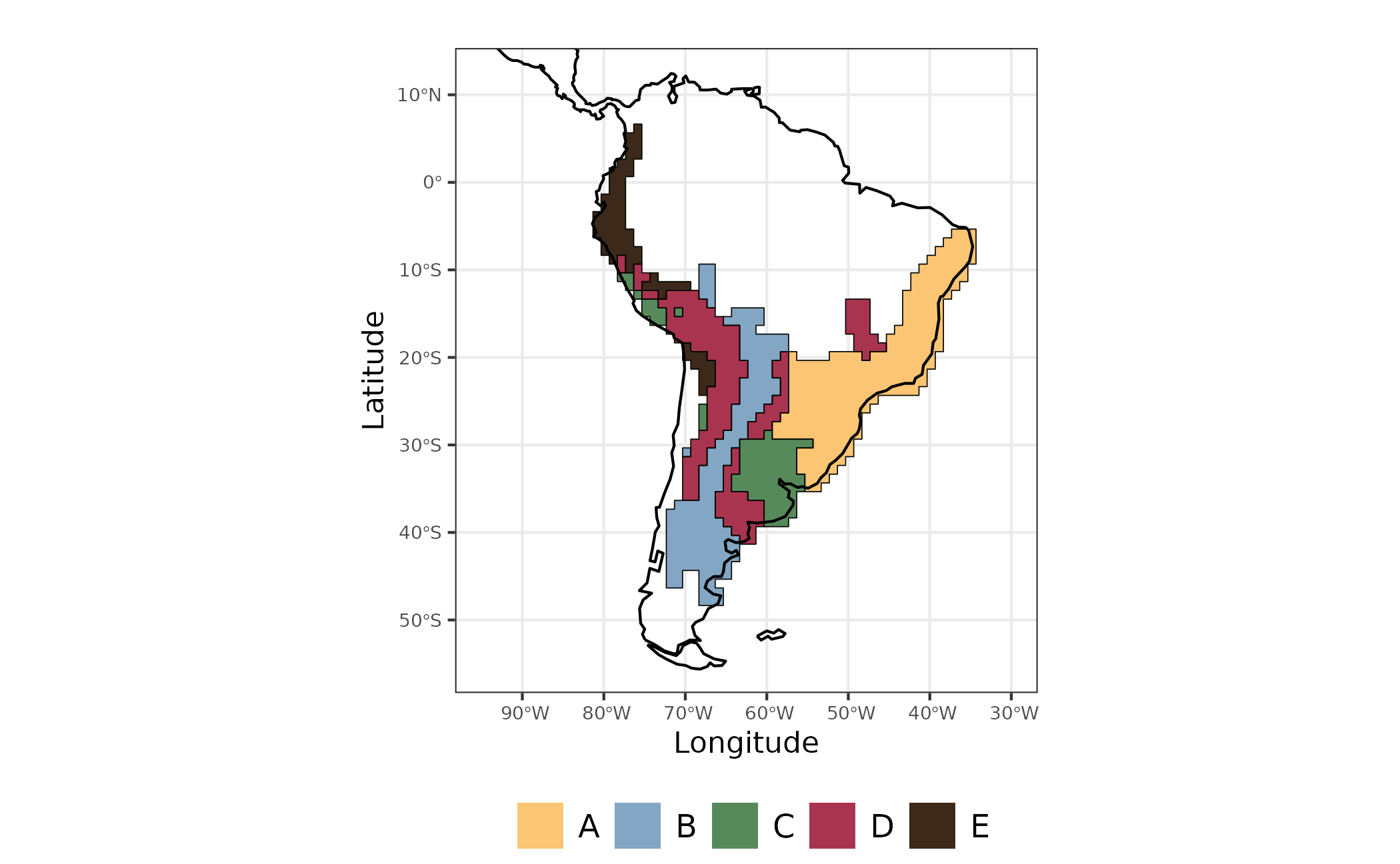
Figure 2 - Evoregions for Akodon species communities
Ancestral area reconstruction will follow the evoregion classification.
Ancestral area reconstruction for Akodon species and in situ diversification metrics
In this section, we demonstrate how Herodotools can use results from macroevolutionary analyses—particularly ancestral state reconstructions—to disentangle the roles of diversification and historical dispersal at the assemblage level. To do so, we use an ancestral area reconstruction performed with BioGeoBEARS, a tool commonly used in macroevolution.
First, we assign species occurrences to evoregions using the
get_region_occ function, obtaining a data frame with
species as rows and evoregions as columns.
a_region <- Herodotools::get_region_occ(comm = akodon_pa_tree, site.region = site_region)The object generated in the previous step can be passed to an auxiliary Herodotools function to easily produce the PHYLIP file required for ancestral area reconstruction in BioGeoBEARS.
# save phyllip file
Herodotools::get_tipranges_to_BioGeoBEARS(
  a_region,
  # please set a new path to save the file
  filename = here::here("inst", "extdata", "geo_area_akodon.data"),
  areanames = NULL
  )
#> Warning in Herodotools::get_tipranges_to_BioGeoBEARS(a_region, filename = here::here("inst", :
#> Note: assigning 'A B C D E' as area names.
#> [1] "/home/runner/work/Herodotools/Herodotools/inst/extdata/geo_area_akodon.data"
Since running BioGeoBEARS can be time-consuming, and demonstrating
how to perform BioGeoBEARS analyses is not the focus here, we instead
read the output from an ancestral range reconstruction performed under
the DEC model to infer evoregions. If you wish to inspect the code used
to run the BioGeoBEARS models, you can access it at
file.edit(system.file("extdata", "script", "e_01_run_DEC_model.R", package = "Herodotools")).
Reading the file containing the results of DEC model reconstruction:
# ancestral reconstruction
load(file = system.file("extdata", "resDEC_akodon.RData", package = "Herodotools"))
It is worth noting that the procedures described here can be adapted to work with any ancestral area reconstruction model implemented in BioGeoBEARS (other than DEC); however, for the sake of simplicity, we chose to use only the DEC model.
Merging ancestral area reconstruction model with assemblage level metrics
Once we have data on present-day occurrence of species, a
biogeographical regionalization (obtained with evoregions
function) and the ancestral area reconstruction, we can integrate these
information to calculate metrics implemented in Herodotools that
represent historical variables at assemblage scale.
Colonization age of assemblages
Here, colonization age of assemblages corresponds to the mean arrival time of the species occupying a given assemblage. By arrival time, we refer to the time at which an ancestor arrived and became established in the assemblage—i.e., with no subsequent dispersal events—within the region where the species currently occurs. For the original description of this metric, see Van Dijk et al. 2021
# converting numbers to character
biogeo_area <- data.frame(biogeo = chartr("12345", "ABCDE", evoregion_df$site_region))

# getting the ancestral range area for each node
node_area <-
  Herodotools::get_node_range_BioGeoBEARS(
    resDEC,
    phyllip.file = here::here("inst", "extdata", "geo_area_akodon.data"),
    akodon_newick,
    max.range.size = 4
  )

# calculating age arrival
age_comm <- Herodotools::calc_age_arrival(W = akodon_pa_tree,
                        tree = akodon_newick,
                        ancestral.area = node_area,
                        biogeo = biogeo_area)
The function calc_age_arrival returns a object
containing the mean age for colonization events of each assemblage.
Species in which the transition to the current region occurred between
the last ancestor and the present can be dealt in two ways: the default
is by represent the age as a very recent arrival age for those species.
Another option is to attribute the age corresponding to half of the
branch length connecting the ancestor to the present time. Here we
adopted the first option.
With mean age for each assemblage we can map the ages for all assemblages
sites <- dplyr::bind_cols(site_xy, site_region =  site_region, age = age_comm$mean_age_per_assemblage)

map_age <-
  sites %>%
  ggplot() +
  ggplot2::geom_raster(ggplot2::aes(x = LONG, y = LAT, fill = mean_age_arrival)) +
  rcartocolor::scale_fill_carto_c(type = "quantitative",
                     palette = "SunsetDark",
                     direction = 1,
                     limits = c(0, 3.5),  ## max percent overall
                     breaks = seq(0, 3.5, by = .5),
                     labels = glue::glue("{seq(0, 3.5, by = 0.5)}")) +
  ggplot2::geom_sf(data = coastline, size = 0.4) +
  ggplot2::coord_sf(xlim = map_limits$x, ylim = map_limits$y) +
  ggplot2::ggtitle("") +
  ggplot2::theme_bw() +
  ggplot2::labs(fill = "Mean age (Myr)") +
  ggplot2::guides(fill = guide_colorbar(barheight = unit(2.3, units = "mm"),
                               direction = "horizontal",
                               ticks.colour = "grey20",
                               title.position = "top",
                               label.position = "bottom",
                               title.hjust = 0.5)) +
  ggplot2::theme(
        legend.position = "bottom",
        plot.margin = unit(c(0.1, 0.1, 0.1, 0.1), "mm"),
        legend.text = element_text(size = 9),
        axis.text = element_text(size = 8),
        axis.title.x = element_text(size = 8),
        axis.title.y = element_text(size = 8),
        plot.subtitle = element_text(hjust = 0.5)
        )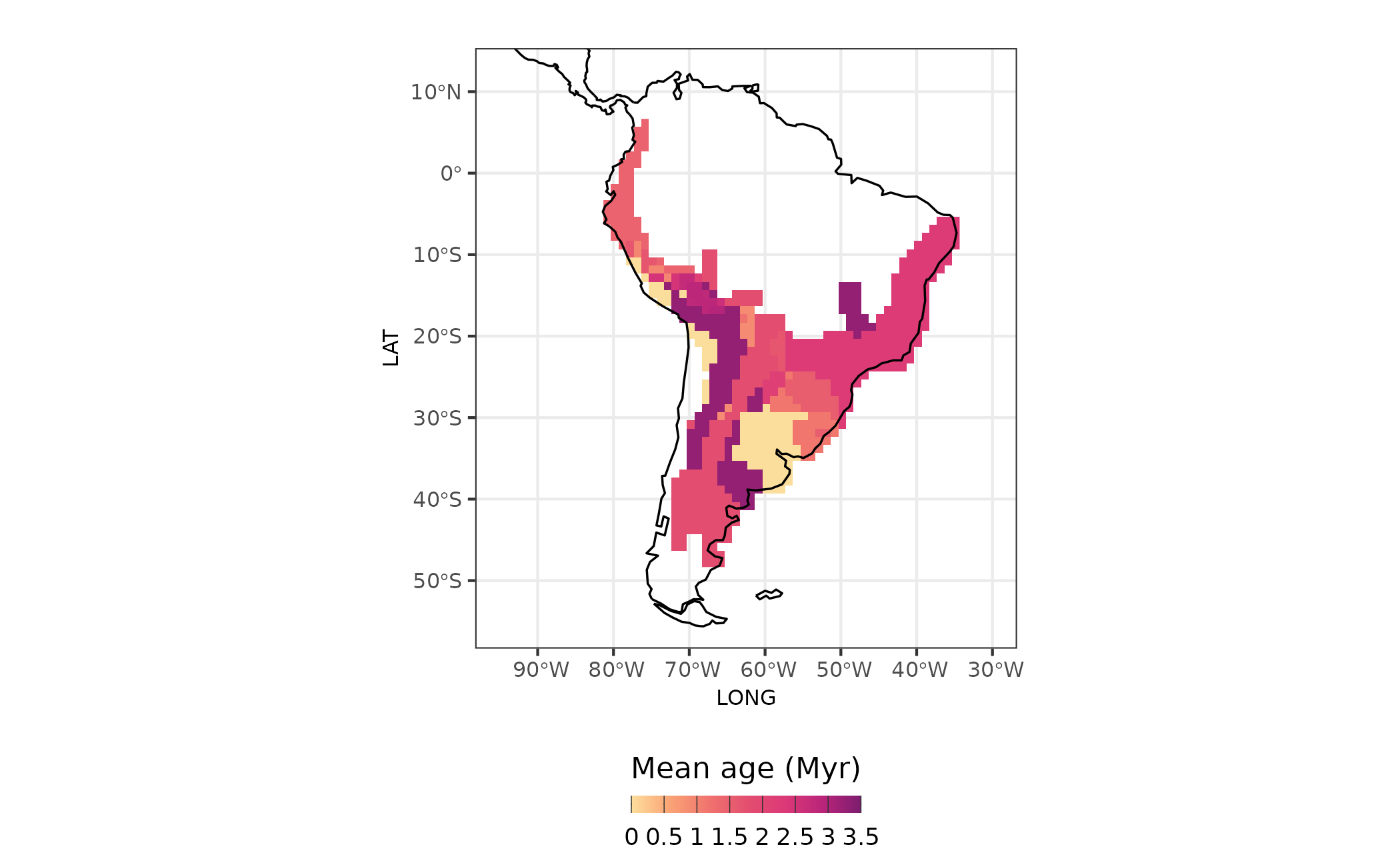
Figure 4 - Age of assemblages
In-situ diversification metrics
We can also calculate measures of diversification considering the macroevolutionary dynamics of ancestors. Specifically, we can measure the importance of in-situ diversification to assemblage level diversification metrics. The new measures allows to decompose the effects of two macroevolutionary process: in-situ diversification and ex situ. Here we will illustrate this by calculating a common tip-based diversification measure proposed by Jetz et al. (2012) that consists in the inverse of equal-splits measure (Redding and Mooers, 2006) called Diversification Rate (DR).
We modified the original DR metric to take into account only the portion of evolutionary history that is associated with the region in which the species currently occupy after coloniztion and establishment (no more dispersal events up to the present). This value represent the diversification that occurred due to in-situ diversification process, and we call it in-situ diversification metric.
akodon_diversification <-
  Herodotools::calc_insitu_diversification(W = akodon_pa_tree,
                                           tree = akodon_newick,
                                           ancestral.area = node_area,
                                           biogeo = biogeo_area,
                                           type = "equal.splits")
The result of calc_insitu_diversification function
consist of a named list containing the following elements:
-
jetz_site_sp: Site-by-species matrix of DR diversification rates. -
jetz_comm_mean: Harmonic mean of DR diversification rates per site. -
insitu_site_sp: Site-by-species matrix of diversification rates. -
insitu_comm_mean: Harmonic mean of diversification rates per site (ignoring zeros when specified). -
prop_site_sp: Site-by-species matrix of proportional diversification rates. -
prop_comm_mean: Arithmetic mean of proportional diversification rates per site.
sites <- dplyr::bind_cols(site_xy,
                   site_region =  site_region,
                   age = age_comm$mean_age_per_assemblage,
                   diversification_model_based = akodon_diversification$insitu_comm_mean,
                   diversification = akodon_diversification$jetz_comm_mean)

map_diversification <-
   sites %>%
   ggplot2::ggplot() +
   ggplot2::geom_raster(ggplot2::aes(x = LONG, y = LAT, fill = diversification)) +
   rcartocolor::scale_fill_carto_c(type = "quantitative", palette = "SunsetDark") +
   ggplot2::geom_sf(data = coastline, size = 0.4) +
   ggplot2::coord_sf(xlim = map_limits$x, ylim = map_limits$y) +
   ggplot2::ggtitle("A") +
   ggplot2::theme_bw() +
   ggplot2::labs(fill = "DR") +
    ggplot2::guides(fill = guide_colorbar(barheight = unit(3, units = "mm"),
                               direction = "horizontal",
                               ticks.colour = "grey20",
                               title.position = "top",
                               label.position = "bottom",
                               title.hjust = 0.5)) +
   ggplot2::theme(
     legend.position = "bottom",
     axis.title = element_blank(),
     axis.text = element_text(size = 6)
   )

map_diversification_insitu <-
  sites %>%
  ggplot2::ggplot() +
  ggplot2::geom_raster(ggplot2::aes(x = LONG, y = LAT, fill = diversification_model_based)) +
  rcartocolor::scale_fill_carto_c(type = "quantitative",
                     palette = "SunsetDark",
                     direction = 1,
                     limits = c(0, 1),  ## max percent overall
                     breaks = seq(0, 1, by = .25),
                     labels = glue::glue("{seq(0, 1, by = 0.25)}")) +
  ggplot2::geom_sf(data = coastline, size = 0.4) +
  ggplot2::coord_sf(xlim = map_limits$x, ylim = map_limits$y) +
  ggplot2::ggtitle("B") +
  ggplot2::theme_bw() +
  ggplot2::labs(fill = "In situ diversification") +
  ggplot2::guides(fill = guide_colorbar(barheight = unit(3, units = "mm"),
                               direction = "horizontal",
                               ticks.colour = "grey20",
                               title.position = "top",
                               label.position = "bottom",
                               title.hjust = 0.5)) +
  ggplot2::theme(
    legend.position = "bottom",
    axis.title = element_blank(),
    legend.text = element_text(size = 6),
    axis.text = element_text(size = 8),
    plot.subtitle = element_text(hjust = 0.5)
  )

library(patchwork) # using patchwork to put the maps together
map_diversification_complete <- map_diversification + map_diversification_insitu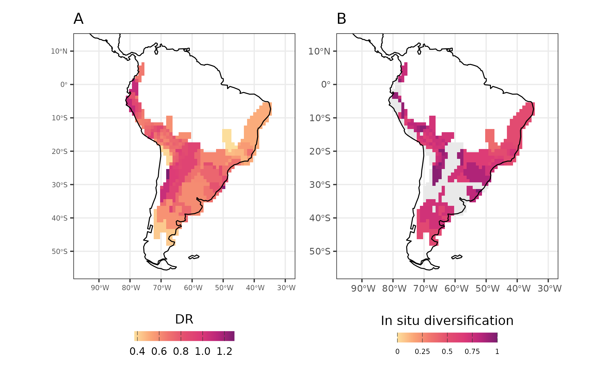
Figure 5 - Diversification rates (DR - A) and in-situ diversification (in-situ diversification - B) for Akodon assemblages
Historical dispersal events
We can also calculate the importance of dispersal events. By using
the function calc_dispersal_from we can quantify the
contribution of a given region to historical dispersal of the species in
present-day assemblages. This is done by calculating the proportion of
species in an assemblage that dispersed from the focal ancestral range
to other regions. This calculation accounts only for the species that
present events of dispersal in its ancestral lineage, in other words,
species that presented their whole history within a single area are not
considered in this analysis.
akodon_dispersal <-
Herodotools::calc_dispersal_from(W = akodon_pa_tree,
               tree = akodon_newick,
               ancestral.area = node_area,
               biogeo = biogeo_area)
We also can map the contribution of dispersal for all regions. Note that the focal area of ancestral range in each map have no values of dipersal from metric, since it is the source of dispersal to the other regions.
sites <- dplyr::bind_cols(site_xy,
                   site_region =  site_region,
                   age = age_comm$mean_age_per_assemblage,
                   diversification = akodon_diversification$Jetz_harmonic_mean_site,
                   diversification_model_based = akodon_diversification$insitu_Jetz_harmonic_mean_site,
                   dispersal.D = akodon_dispersal[,1],
                   dispersal.A = akodon_dispersal[, 2],
                   dispersal.E = akodon_dispersal[, 3],
                   dispersal.BD = akodon_dispersal[, 4],
                   dispersal.B = akodon_dispersal[, 5])

map_dispersal_D <-
   sites %>%
   ggplot2::ggplot() +
   ggplot2::geom_raster(ggplot2::aes(x = LONG, y = LAT, fill = dispersal.D)) +
      rcartocolor::scale_fill_carto_c(
      type = "quantitative", palette = "SunsetDark", na.value = "white", limits = c(0,1)
     ) +
   ggplot2::geom_sf(data = coastline, size = 0.4) +
   ggplot2::coord_sf(xlim = map_limits$x, ylim = map_limits$y) +
   ggplot2::ggtitle("From D") +
   ggplot2::theme_bw() +
   ggplot2::labs(fill = "% of contribution") +
   ggplot2::theme(
    legend.position = "right",
    axis.title = element_blank(),
    legend.text = element_text(size = 6),
    legend.title = element_text(size = 8),
    axis.text = element_text(size = 3),
    plot.subtitle = element_text(hjust = 0.5)
  )

map_dispersal_A <-
   sites %>%
   ggplot2::ggplot() +
   ggplot2::geom_raster(ggplot2::aes(x = LONG, y = LAT, fill = dispersal.A)) +
      rcartocolor::scale_fill_carto_c(
     type = "quantitative", palette = "SunsetDark", na.value = "white", limits = c(0,1)
     ) +
   ggplot2::geom_sf(data = coastline, size = 0.4) +
   ggplot2::coord_sf(xlim = map_limits$x, ylim = map_limits$y) +
   ggplot2::ggtitle("From A") +
   ggplot2::theme_bw() +
   ggplot2::labs(fill = "% of contribution") +
   ggplot2::theme(
    legend.position = "right",
    axis.title = element_blank(),
    legend.text = element_text(size = 6),
    legend.title = element_text(size = 8),
    axis.text = element_text(size = 3),
    plot.subtitle = element_text(hjust = 0.5)
  )

map_dispersal_B <-
   sites %>%
   ggplot2::ggplot() +
   ggplot2::geom_raster(ggplot2::aes(x = LONG, y = LAT, fill = dispersal.B)) +
   rcartocolor::scale_fill_carto_c(
     type = "quantitative", palette = "SunsetDark", na.value = "white", limits = c(0,1)
     ) +
   ggplot2::geom_sf(data = coastline, size = 0.4) +
   ggplot2::coord_sf(xlim = map_limits$x, ylim = map_limits$y) +
   ggplot2::ggtitle("From B") +
   ggplot2::theme_bw() +
   ggplot2::labs(fill = "% of contribution") +
   ggplot2::theme(
     legend.position = "right",
     axis.title = element_blank(),
     legend.text = element_text(size = 6),
     legend.title = element_text(size = 8),
     axis.text = element_text(size = 3),
     plot.subtitle = element_text(hjust = 0.5)
   )
l_map_disp <- list(
  map_dispersal_A ,
  map_dispersal_B,
  map_dispersal_D
)


chart_disp <- wrap_plots(l_map_disp, guides = "collect")

(map_evoregion / chart_disp) +
  plot_layout(heights = c(2, 1.2))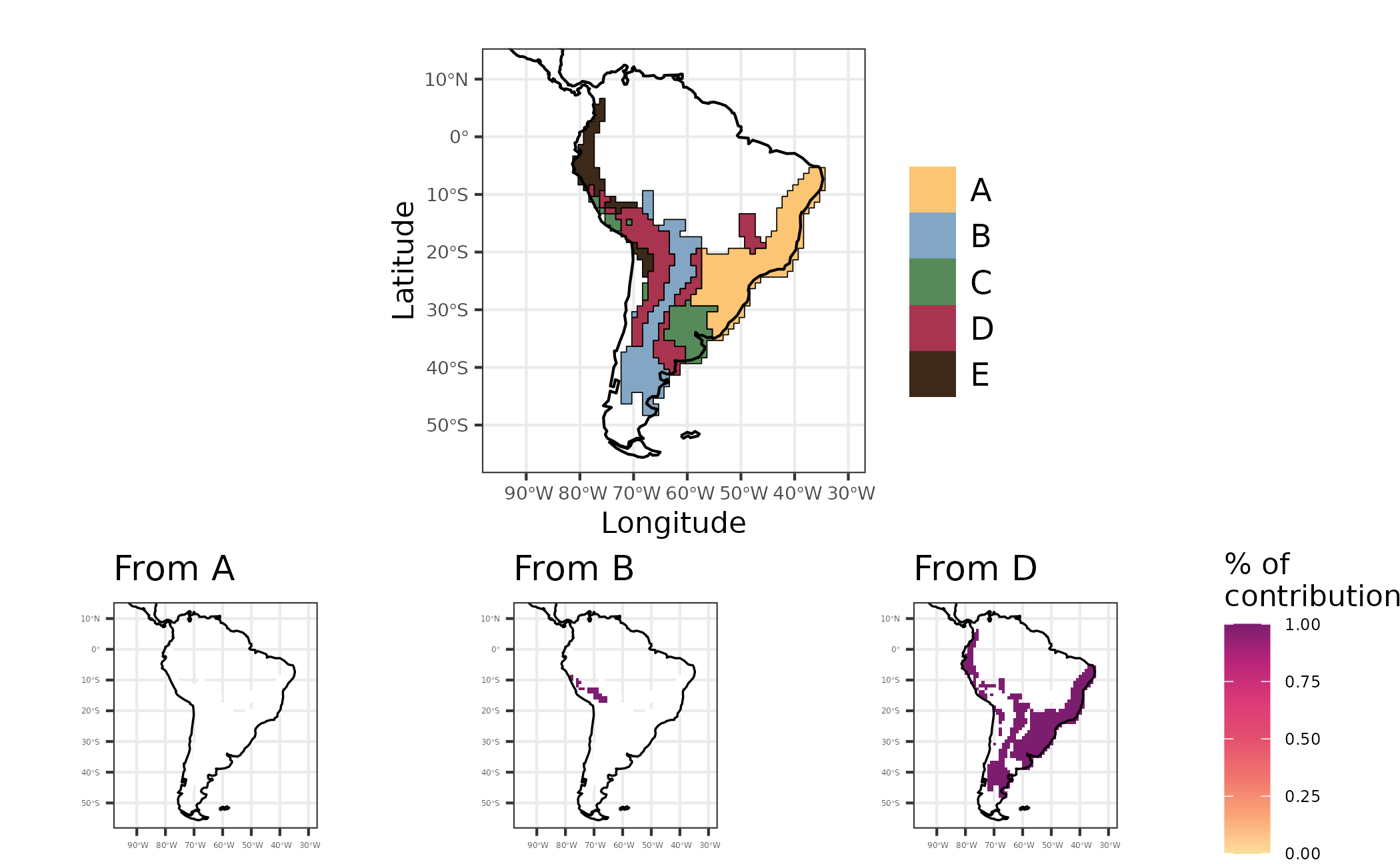
Figure 6 - Maps showing regionalization based on phylogenetic turnover (evoregion - top figure), and the contribution of regions A, B and D to other regions regarding historical dispersal of lineages
References
Duarte, L. D. S., Debastiani, V. J., Freitas, A. V. L., & Pillar, V. D. P. (2016). Dissecting phylogenetic fuzzy weighting: theory and application in metacommunity phylogenetics. Methods in Ecology and Evolution, February, 937-946. doi.org/10.1111/2041-210X.12547
Jombart, T., Devillar S., & Ballox, F. (2010). Discriminant analysis of principal components: a new method for the analysis of genetically structured populations. BMC Genomic Data.
Luza, A. L., Maestri, R., Debastiani, V. J., Patterson, B. D., Maria, S., & Leandro, H. (2021). Is evolution faster at ecotones? A test using rates and tempo of diet transitions in Neotropical Sigmodontinae ( Rodentia , Cricetidae ). Ecology and Evolution, December, 18676–18690. https://doi.org/10.1002/ece3.8476
Maestri, R., & Duarte, L. D. S. (2020). Evoregions: Mapping shifts in phylogenetic turnover across biogeographic regions Renan Maestri. Methods in Ecology and Evolution, 2020(August), 1652–1662. https://doi.org/10.1111/2041-210X.13492
Pigot, A. and Etienne, R. (2015). A new dynamic null model for phylogenetic community structure. Ecology Letters, 18(2), 153-163. https://doi.org/10.1111/ele.12395
Van Dijk, A., Nakamura, G., Rodrigues, A. V., Maestri, R., & Duarte, L. (2021b). Imprints of tropical niche conservatism and historical dispersal in the radiation of Tyrannidae (Aves: Passeriformes). Biological Journal of the Linnean Society, 134(1), 57–67. https://doi.org/10.1093/biolinnean/blab079