Using Herodotools to analyses of historical biogeography
Intro_Herodotools_vignette.RmdThis article will show the main functions of Herodotools
package. To do so, we will evaluate imprints of historical processes
like in situ diversification, historical dispersal, macroevolutionary
dynamics in species traits (this last using Sigmodontinae clade) of
species assemblages from the genus Akodon.
For this aim we will perform the following steps:
- Process raw species occurrence data and phylogenetic information
-
Classify Akodon assemblages in meaningful
regions using
evoregionfunction - Calculate macroevolutionary metrics of in situ diversification at assemblage level using an ancestral state reconstruction model
- Calculate community phylogenetic metrics while accounting by in situ diversification process
- Calculate tip-based metrics of trait macroevolutionary dynamics
Reading data and libraries
First, let’s read some libraries we will use to explore the data and produce the figures. If you do not have the packages already installed, they will be installed using the following code.
libs <- c("ape", "picante", "dplyr", "tidyr", "purrr",
          "raster", "terra", "ggplot2", "stringr",
          "here", "sf", "rnaturalearth", "rcartocolor", "patchwork")
if (!requireNamespace(libs, quietly = TRUE)){
    install.packages(libs)
  }
There are two packages that are not in CRAN (daee and BioGeoBEARS) and are required to run the analysis in this vignette. We suggest installing and reading these packages from Github using the following code:
if (!requireNamespace(c("daee","BioGeoBEARS"), quietly = TRUE)){
  devtools::install_github("vanderleidebastiani/daee")
  devtools::install_github("nmatzke/BioGeoBEARS")
}
library(daee)
library(BioGeoBEARS)
Now we need to read the files corresponding to the distribution of species in assemblages of 1x1 cell degrees, and phylogenetic relationship that will be used in downstream analysis with Herodotools
library(Herodotools)
data("akodon_sites")
data("akodon_newick")
Data processing
Here we will perform a few data processing in order to get spatial and occurrence information
site_xy <- akodon_sites %>%
  dplyr::select(LONG, LAT)

akodon_pa <- akodon_sites %>%
  dplyr::select(-LONG, -LAT)
Checking if species names between occurrence matrix and phylogenetic tree are matching
Exploring spatial patterns
Here we can plot richness pattern for Akodon genus. For this we will read the ggplot2 package to produce some maps
library(ggplot2)
coastline <- rnaturalearth::ne_coastline(returnclass = "sf")
#> The legacy packages maptools, rgdal, and rgeos, underpinning the sp package,
#> which was just loaded, will retire in October 2023.
#> Please refer to R-spatial evolution reports for details, especially
#> https://r-spatial.org/r/2023/05/15/evolution4.html.
#> It may be desirable to make the sf package available;
#> package maintainers should consider adding sf to Suggests:.
#> The sp package is now running under evolution status 2
#>      (status 2 uses the sf package in place of rgdal)
map_limits <- list(
  x = c(-95, -30),
  y = c(-55, 12)
)

richness <- rowSums(akodon_pa_tree)

map_richness <-
dplyr::bind_cols(site_xy, richness = richness) %>%
  ggplot2::ggplot() +
  ggplot2::geom_raster(ggplot2::aes(x = LONG, y = LAT, fill = richness)) +
  rcartocolor::scale_fill_carto_c(name = "Richness", type = "quantitative", palette = "SunsetDark") +
  ggplot2::geom_sf(data = coastline) +
  ggplot2::coord_sf(xlim = map_limits$x, ylim = map_limits$y) +
  ggplot2::ggtitle("") +
  ggplot2::xlab("Longitude") +
  ggplot2::ylab("Latitude") +
  ggplot2::labs(fill = "Richness") +
  ggplot2::theme_bw() +
  ggplot2::theme(
        plot.margin = unit(c(0.1, 0.1, 0.1, 0.1), "mm"),
        legend.text = element_text(size = 12),
        axis.text = element_text(size = 7),
        axis.title.x = element_text(size = 11),
        axis.title.y = element_text(size = 11)
        )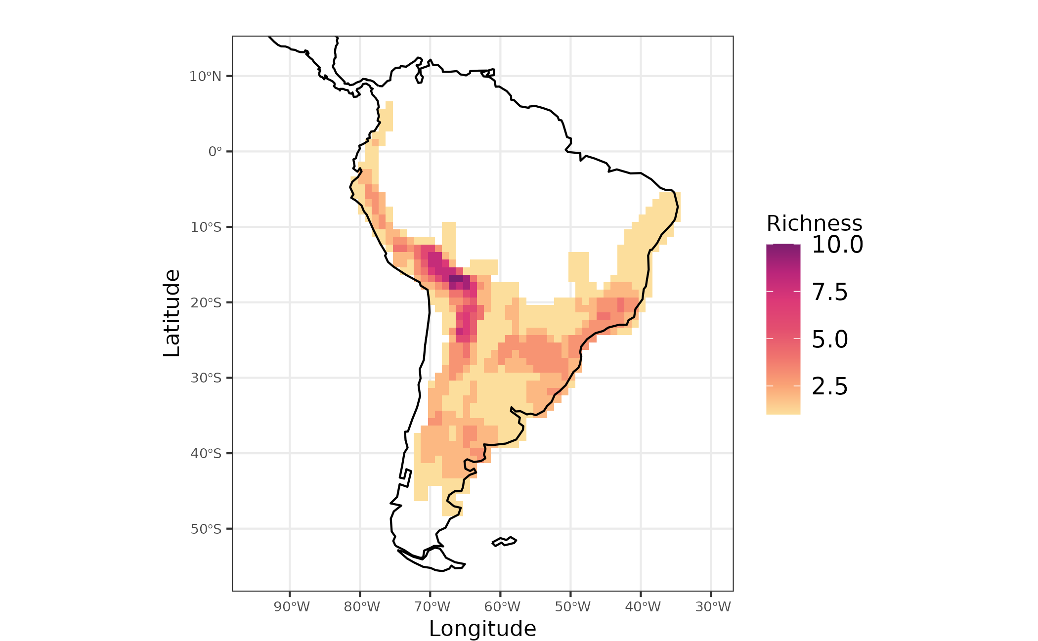
Figure 1 - Species richness for Akodon genus in South America
Obtaining evoregions
Here we will use the function calc_evoregion, originally
described in Maestri
and Duarte (2020), and implemented in Herodotools package. This
method of classification allows to perform a biogeographical
regionalization based on a phylogenetic fuzzy
matrix coupled with a Discriminant
Analysis of Principal Components based on k-means non-hierarchical
clustering. Evoregions can be viewed as areas corresponding to
centers of independent diversification of lineages, reflecting the
historical radiation of single clades (Maestri and Duarte, 2020).
To calculate evoregions we need an species occurrence matrix and a
phylogenetic tree. If the user decide not informing the maximum number
of clusters, evoregion function will perform an automatic
procedure based on “elbow” method to set the maximum number of clusters.
The “elbow” method is implemented in package phyloregion.
It is worth noting that the original proposition of evoregion method use
a bootstrap method to define the maximum number of clusters to be used
in the analysis. Here we opted to use the “elbow” method mainly due to
computational speed, since this method is faster than the
bootstrap-based method.
NOTE: The regions obtained from
evoregion function will present different names for each
region at each time the user run the analysis. But, the patterns will be
the same for the same dataset. Consequently, if the user run the same
code evoregions will show up with different names, even when specifying
an initial seed for this analysis.
regions <-
  Herodotools::calc_evoregions(
  comm = akodon_pa_tree,
  phy = akodon_newick
  )

site_region <- regions$cluster_evoregions
We have to transform the evoregion results to spatial object in order to visualize in a map the regions. This can be done using the following code:
evoregion_df <- data.frame(
  site_xy,
  site_region
)

r_evoregion <- terra::rast(evoregion_df)

# Converting evoregion to a spatial polygon data frame, so it can be plotted
sf_evoregion <- terra::as.polygons(r_evoregion) %>%
  sf::st_as_sf()


# Downloading coastline continents and croping to keep only South America
coastline <- rnaturalearth::ne_coastline(returnclass = "sf")
map_limits <- list(
  x = c(-95, -30),
  y = c(-55, 12)
)

# Assigning the same projection to both spatial objects
sf::st_crs(sf_evoregion) <- sf::st_crs(coastline)


# Colours to plot evoregions
col_five_hues <- c(
  "#3d291a",
  "#a9344f",
  "#578a5b",
  "#83a6c4",
  "#fcc573"
)
Evoregions can be mapped using the following code
map_evoregion <-
  evoregion_df %>%
  ggplot2::ggplot() +
  ggplot2::geom_raster(ggplot2::aes(x = LONG, y = LAT, fill = site_region)) +
  ggplot2::scale_fill_manual(
    name = "",
    labels = LETTERS[1:5],
    values = rev(col_five_hues)
  ) +
  ggplot2::geom_sf(data = coastline) +
  ggplot2::geom_sf(
    data = sf_evoregion,
    color = "#040400",
    fill = NA,
    size = 0.2) +
  ggplot2::coord_sf(xlim = map_limits$x, ylim = map_limits$y) +
  ggplot2::ggtitle("") +
  ggplot2::theme_bw() +
  ggplot2::xlab("Longitude") +
  ggplot2::ylab("Latitude") +
  ggplot2::theme(
        legend.position = "bottom",
        plot.margin = unit(c(0.1, 0.1, 0.1, 0.1), "mm"),
        legend.text = element_text(size = 12),
        axis.text = element_text(size = 7),
        axis.title.x = element_text(size = 11),
        axis.title.y = element_text(size = 11)
        )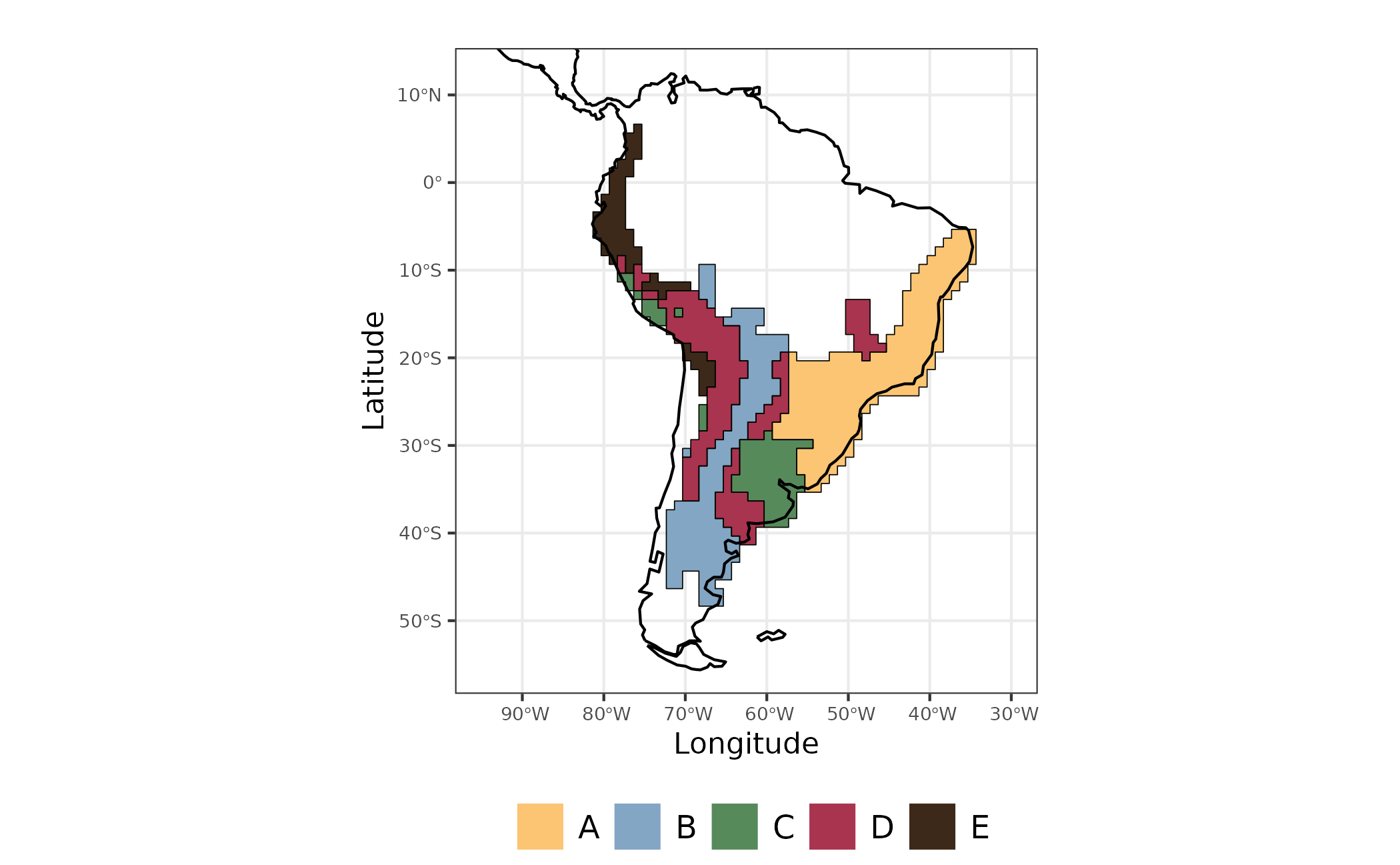
Figure 2 - Evoregions for Akodon species communities
The output from evoregion produced five distinct
regions. However, not all cells have the same degree of affiliation with
the region in which it was classified. Cells with high affiliation
indicates assemblages that are more similar to the other cells presented
in a region. On the other hand, assemblages with low values of
affiliation correspond to areas with high
turnover, in other words, areas with multiple events of colonization
by different lineages (Maestri and Duarte, 2020).
# Selecting only axis with more than 5% of explained variance from evoregion output
axis_sel <- which(regions$PCPS$prop_explainded >= regions$PCPS$tresh_dist)
PCPS_thresh <- regions$PCPS$vectors[, axis_sel]

# distance matrix using 4 significant PCPS axis accordingly to the 5% threshold
dist_phylo_PCPS <- vegan::vegdist(PCPS_thresh, method = "euclidean")

# calculating affiliation values for each assemblage
afi <- calc_affiliation_evoreg(phylo.comp.dist = dist_phylo_PCPS,
                          groups = site_region)

# binding the information in a data frame
sites <- dplyr::bind_cols(site_xy, site_region =  site_region, afi)
Now we can map evoregions and the affiliation of each cell. The degree of affiliation of cells are showed as the degree of fading for each color representing the evoregions. As faded the color of the cell, lesser the affiliation of that cell to its evoregion.
map_joint_evoregion_afilliation <-
   evoregion_df %>%
   ggplot() +
   ggplot2::geom_raster(ggplot2::aes(x = LONG, y = LAT, fill = site_region),
               alpha = sites[, "afilliation"]) +
   ggplot2::scale_fill_manual(
     name = "",
     labels = LETTERS[1:5],
     values = rev(col_five_hues)
   ) +
   ggplot2::geom_sf(data = coastline, size = 0.4) +
   ggplot2::geom_sf(
     data = sf_evoregion,
     color = rev(col_five_hues),
     fill = NA,
     size = 0.7) +
   ggplot2::coord_sf(xlim = map_limits$x, ylim = map_limits$y) +
   ggplot2::ggtitle("") +
   guides(guide_legend(direction = "vertical")) +
   ggplot2::theme_bw() +
  ggplot2::xlab("Longitude") +
  ggplot2::ylab("Latitude") +
  ggplot2::theme(
        legend.position = "bottom",
        plot.margin = unit(c(0.1, 0.1, 0.1, 0.1), "mm"),
        legend.text = element_text(size = 10),
        axis.text = element_text(size = 8),
        axis.title.x = element_text(size = 10),
        axis.title.y = element_text(size = 10)
        )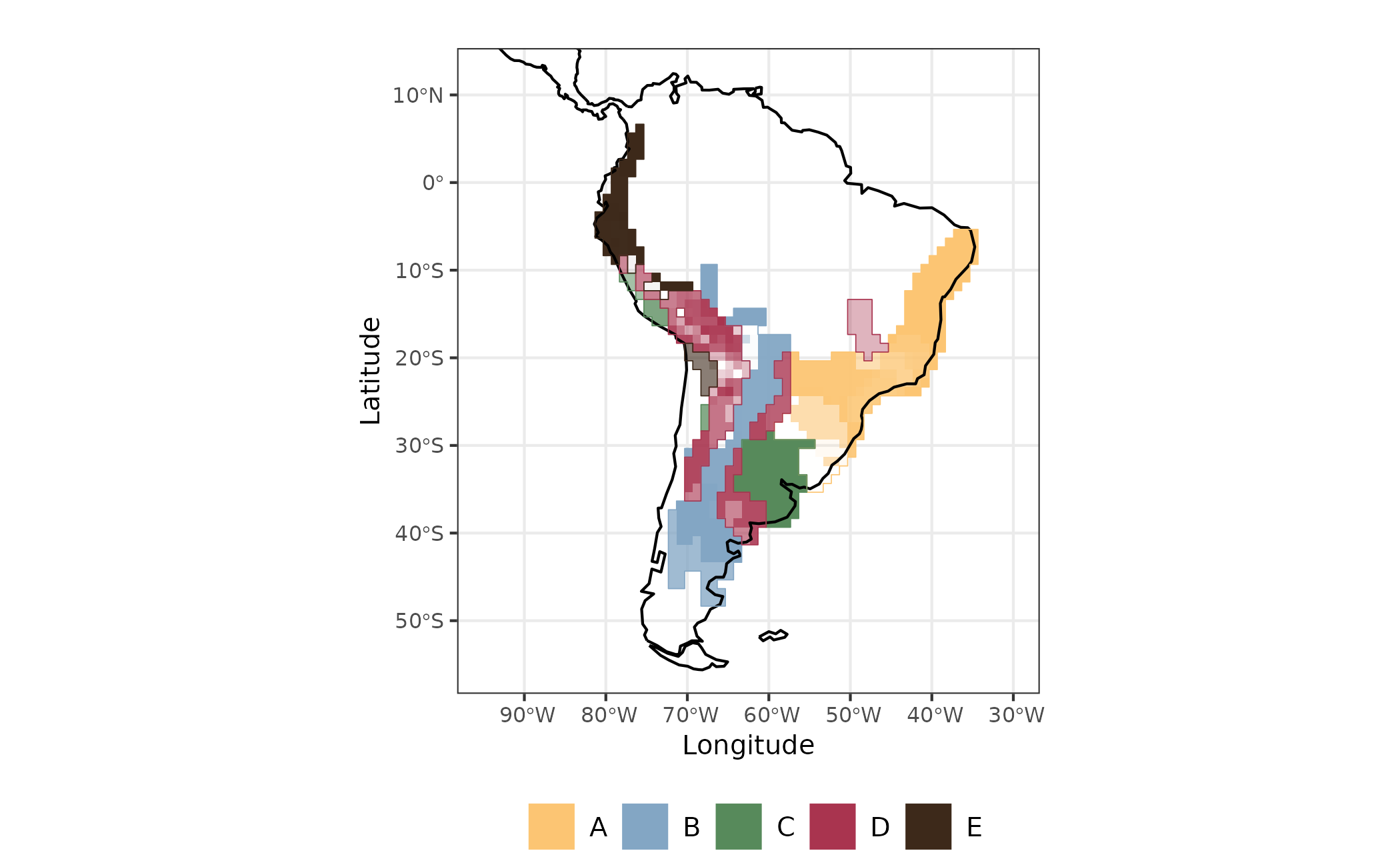
Figure 3 - Evoregion and afilliation for communities of Akodon Genus
Ancestral area reconstruction for Akodon species and in situ diversification metrics
In this section we will show how Herodotools can get the results coming from macroevolutionary analysis, particularly, analysis of ancestral state reconstruction, to understand the role of diversification and historical dispersal at assemblage level. For this we will use an ancestral area reconstruction performed with BioGeoBEARS, a tool commonly used in macroevolution.
First, we have to assign the occurrence of each species in the
evoregions. To do this we can use the function
get_region_occ and obtain a data frame of species in the
lines and evoregions in the columns.
a_region <- Herodotools::get_region_occ(comm = akodon_pa_tree, site.region = site_region)The object created in the last step can be used in an auxiliary function in Herodotools to easily obtain the Phyllip file required to run the analysis of ancestral area reconstruction using BioGeoBEARS.
# save phyllip file
Herodotools::get_tipranges_to_BioGeoBEARS(
  a_region,
  # please set a new path to save the file
  filename = here::here("inst", "extdata", "geo_area_akodon.data"),
  areanames = NULL
  )
#> Warning in Herodotools::get_tipranges_to_BioGeoBEARS(a_region, filename = here::here("inst", :
#> Note: assigning 'A B C D E' as area names.
#> [1] "/home/runner/work/Herodotools/Herodotools/inst/extdata/geo_area_akodon.data"
Since it take some time to run BioGeoBEARS (about 15 minutes in a 4GB
processor machine), and showing how to perform analysis with
BioGeoBEARSwe are not our focus here, we can just read an output from an
ancestral analysis reconstruction performed using DEC model to
reconstruct the evoregions. If you want to check out the code used to
run the BioGeoBEARS models, you can access it with
file.edit(system.file("extdata", "script", "e_01_run_DEC_model.R", package = "Herodotools")).
Reading the file containing the results of DEC model reconstruction:
# ancestral reconstruction
load(file = system.file("extdata", "resDEC_akodon.RData", package = "Herodotools"))
It is worth to note that the procedures described here can be adapted to work with any model of ancestral area reconstruction from BioGeoBEARS (other than DEC), but for sake of simplicity we decided to use only the DEC model.
Merging macroevolutionary models with assemblage level metrics
Once we have data on present-day occurrence of species, a
biogeographical regionalization (obtained with evoregions
function) and the ancestral area reconstruction, we can integrate these
information to calculate metrics implemented in Herodotools that
represent historical variables at assemblage scale.
Age of assemblages
Let’s start by calculating the age of each cell considering the macroevolutionary dynamics of in-situ diversification during time . The age here corresponds to the mean arrival time of each species occupying a given assemblage. By arrival time we mean the time in which the an ancestor arrived and stablished (no more dispersal events in between) at the assemblage within a region in which the current species occur today. For the original description of this metric see Van Dijk et al. 2021
# converting numbers to character
biogeo_area <- data.frame(biogeo = chartr("12345", "ABCDE", evoregion_df$site_region))

# getting the ancestral range area for each node
node_area <-
  Herodotools::get_node_range_BioGeoBEARS(
    resDEC,
    phyllip.file = here::here("inst", "extdata", "geo_area_akodon.data"),
    akodon_newick,
    max.range.size = 4
  )

# calculating age arrival
age_comm <- Herodotools::calc_age_arrival(W = akodon_pa_tree,
                        tree = akodon_newick,
                        ancestral.area = node_area,
                        biogeo = biogeo_area)
The function calc_age_arrival returns a object
containing the mean age for each assemblage. Species in which the
transition to the current region occurred between the last ancestor and
the present can be dealt in two ways: the default is by represent the
age as a very recent arrival age for those species. Another option is to
attribute the age corresponding to half of the branch length connecting
the ancestor to the present time. Here we adopted the first option.
With mean age for each assemblage we can map the ages for all assemblages
sites <- dplyr::bind_cols(site_xy, site_region =  site_region, age = age_comm$mean_age_per_assemblage)

map_age <-
  sites %>%
  ggplot() +
  ggplot2::geom_raster(ggplot2::aes(x = LONG, y = LAT, fill = mean_age_arrival)) +
  rcartocolor::scale_fill_carto_c(type = "quantitative",
                     palette = "SunsetDark",
                     direction = 1,
                     limits = c(0, 3.5),  ## max percent overall
                     breaks = seq(0, 3.5, by = .5),
                     labels = glue::glue("{seq(0, 3.5, by = 0.5)}")) +
  ggplot2::geom_sf(data = coastline, size = 0.4) +
  ggplot2::coord_sf(xlim = map_limits$x, ylim = map_limits$y) +
  ggplot2::ggtitle("") +
  ggplot2::theme_bw() +
  ggplot2::labs(fill = "Mean age (Myr)") +
  ggplot2::guides(fill = guide_colorbar(barheight = unit(2.3, units = "mm"),
                               direction = "horizontal",
                               ticks.colour = "grey20",
                               title.position = "top",
                               label.position = "bottom",
                               title.hjust = 0.5)) +
  ggplot2::theme(
        legend.position = "bottom",
        plot.margin = unit(c(0.1, 0.1, 0.1, 0.1), "mm"),
        legend.text = element_text(size = 9),
        axis.text = element_text(size = 8),
        axis.title.x = element_text(size = 8),
        axis.title.y = element_text(size = 8),
        plot.subtitle = element_text(hjust = 0.5)
        )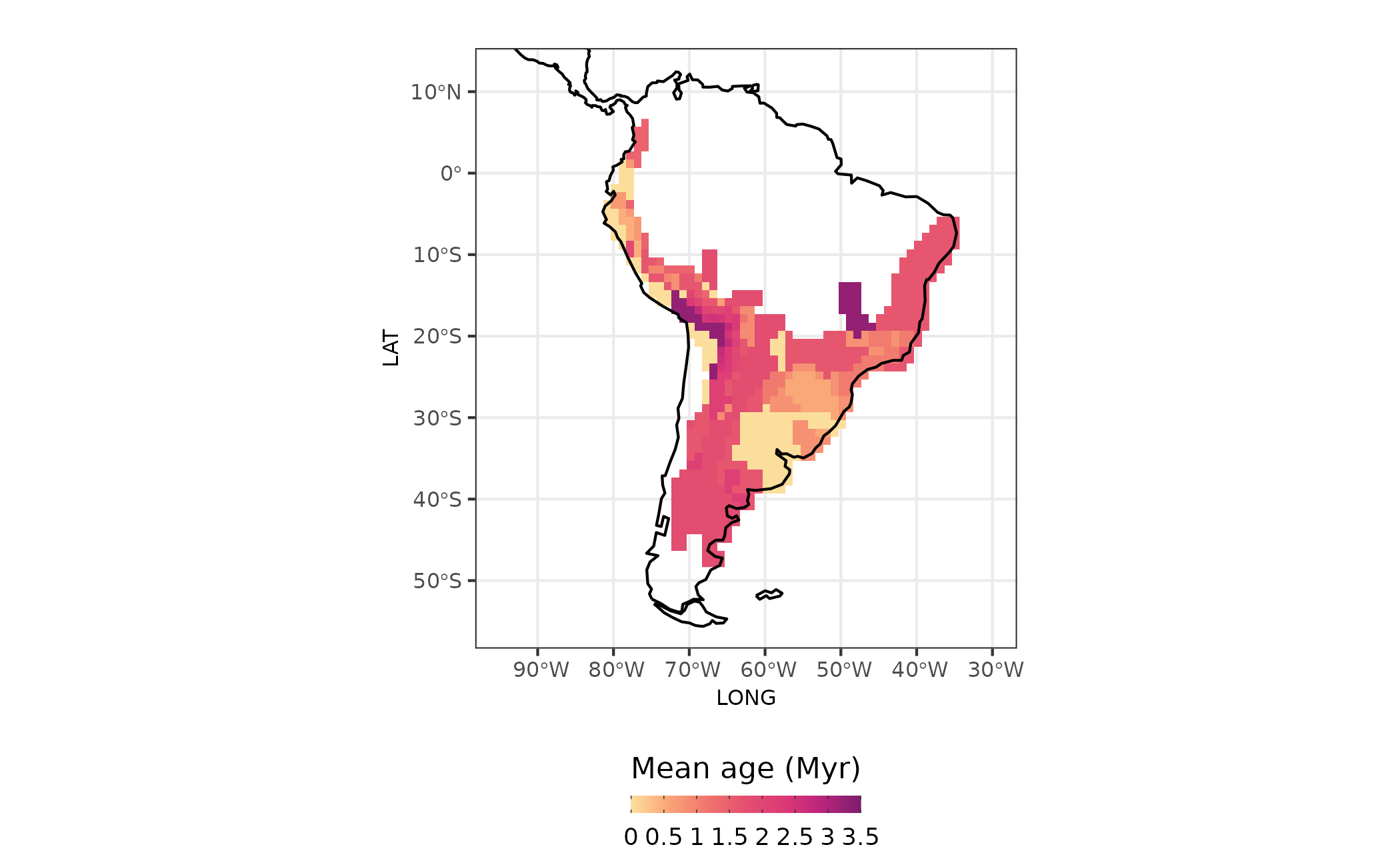
Figure 4 - Age of assemblages
In-situ diversification metrics
We can also calculate measures of diversification considering the macroevolutionary dynamics of ancestors. Specifically, we can measure the importance of in-situ diversification to assemblage level diversification metrics. The new measures allows to decompose the effects of two macroevolutionary process: in-situ diversification and ex situ. Here we will illustrate this by calculating a common tip-based diversification measure proposed by Jetz et al. (2012) that consists in the inverse of equal-splits measure (Redding and Mooers, 2006) called Diversification Rate (DR).
We modified the original DR metric to take into account only the portion of evolutionary history that is associated with the region in which the species currently occupy after coloniztion and establishment (no more dispersal events up to the present). This value represent the diversification that occurred due to in-situ diversification process, and we call it in-situ diversification metric.
akodon_diversification <-
Herodotools::calc_insitu_diversification(W = akodon_pa_tree,
                   tree = akodon_newick,
                   ancestral.area = node_area,
                   biogeo = biogeo_area,
                   diversification = "jetz",
                   type = "equal.splits")
The result of calc_insitu_diversification function
consist of a data-frame containing the value of in-situ diversification
for each species in each assemblage and a vector containing the harmonic
mean of in-situ diversification for each assemblage. As with age, we can
plot the in-situ diversification metric to look at the spatial patterns
in Akodon assemblages.
sites <- dplyr::bind_cols(site_xy,
                   site_region =  site_region,
                   age = age_comm$mean_age_per_assemblage,
                   diversification_model_based = akodon_diversification$insitu_Jetz_harmonic_mean_site,
                   diversification = akodon_diversification$Jetz_harmonic_mean_site)

map_diversification <-
   sites %>%
   ggplot2::ggplot() +
   ggplot2::geom_raster(ggplot2::aes(x = LONG, y = LAT, fill = diversification)) +
   rcartocolor::scale_fill_carto_c(type = "quantitative", palette = "SunsetDark") +
   ggplot2::geom_sf(data = coastline, size = 0.4) +
   ggplot2::coord_sf(xlim = map_limits$x, ylim = map_limits$y) +
   ggplot2::ggtitle("A") +
   ggplot2::theme_bw() +
   ggplot2::labs(fill = "DR") +
    ggplot2::guides(fill = guide_colorbar(barheight = unit(3, units = "mm"),
                               direction = "horizontal",
                               ticks.colour = "grey20",
                               title.position = "top",
                               label.position = "bottom",
                               title.hjust = 0.5)) +
   ggplot2::theme(
     legend.position = "bottom",
     axis.title = element_blank(),
     axis.text = element_text(size = 6)
   )

map_diversification_insitu <-
  sites %>%
  ggplot2::ggplot() +
  ggplot2::geom_raster(ggplot2::aes(x = LONG, y = LAT, fill = diversification_model_based)) +
  rcartocolor::scale_fill_carto_c(type = "quantitative",
                     palette = "SunsetDark",
                     direction = 1,
                     limits = c(0, 1),  ## max percent overall
                     breaks = seq(0, 1, by = .25),
                     labels = glue::glue("{seq(0, 1, by = 0.25)}")) +
  ggplot2::geom_sf(data = coastline, size = 0.4) +
  ggplot2::coord_sf(xlim = map_limits$x, ylim = map_limits$y) +
  ggplot2::ggtitle("B") +
  ggplot2::theme_bw() +
  ggplot2::labs(fill = "In situ diversification") +
  ggplot2::guides(fill = guide_colorbar(barheight = unit(3, units = "mm"),
                               direction = "horizontal",
                               ticks.colour = "grey20",
                               title.position = "top",
                               label.position = "bottom",
                               title.hjust = 0.5)) +
  ggplot2::theme(
    legend.position = "bottom",
    axis.title = element_blank(),
    legend.text = element_text(size = 6),
    axis.text = element_text(size = 8),
    plot.subtitle = element_text(hjust = 0.5)
  )

library(patchwork) # using patchwork to put the maps together
map_diversification_complete <- map_diversification + map_diversification_insitu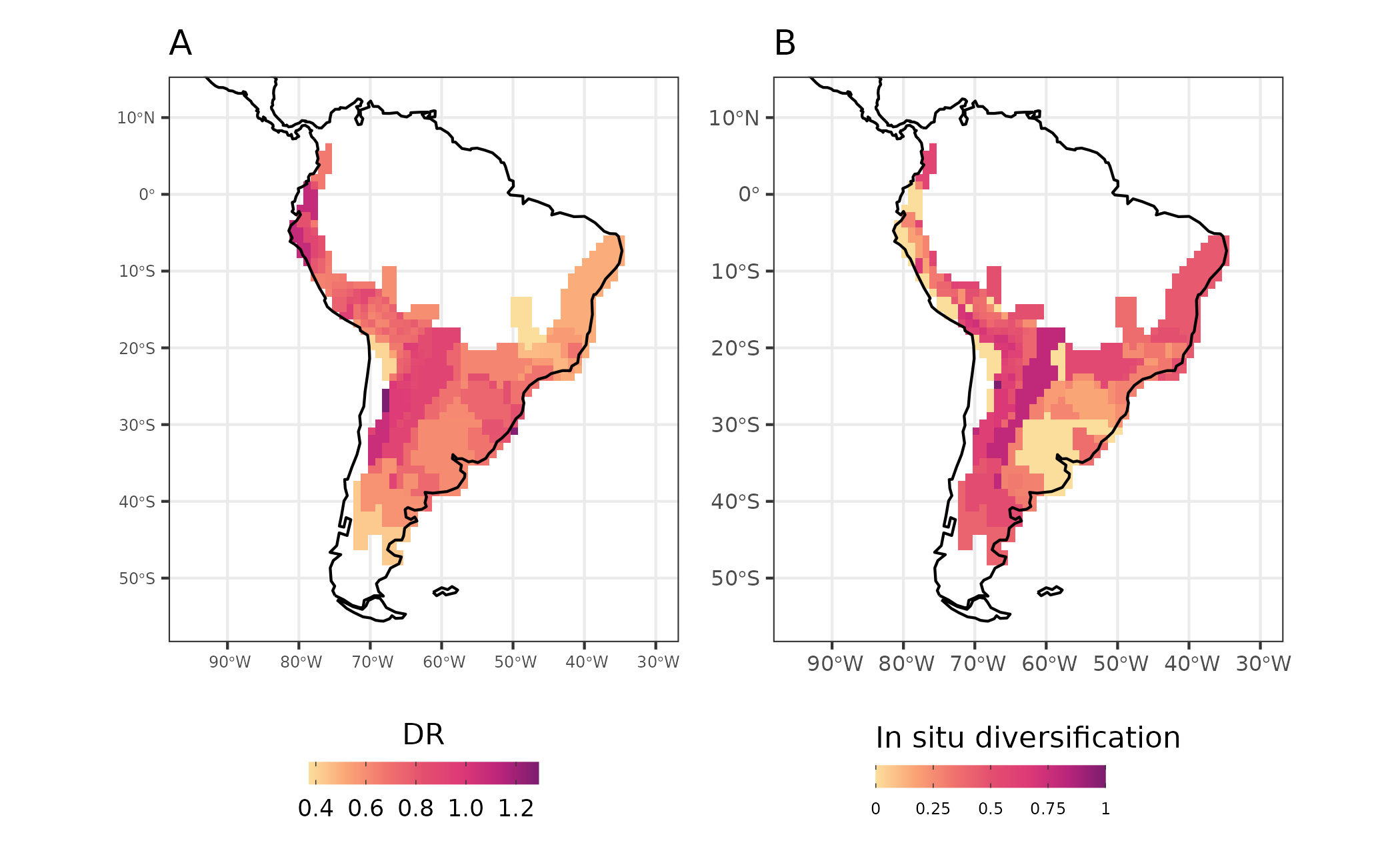
Figure 5 - Diversification rates (DR - A) and in-situ diversification (in-situ diversification - B) for Akodon assemblages
Historical dispersal events
We can also calculate the importance of dispersal events. By using
the function calc_dispersal_from we can quantify the
contribution of a given region to historical dispersal of the species in
present-day assemblages. This is done by calculating the proportion of
species in an assemblage that dispersed from the focal ancestral range
to other regions. This calculation accounts only for the species that
present events of dispersal in its ancestral lineage, in other words,
species that presented their whole history within a single area are not
considered in this analysis.
akodon_dispersal <-
Herodotools::calc_dispersal_from(W = akodon_pa_tree,
               tree = akodon_newick,
               ancestral.area = node_area,
               biogeo = biogeo_area)
We also can map the contribution of dispersal for all regions. Note that the focal area of ancestral range in each map have no values of dipersal from metric, since it is the source of dispersal to the other regions.
sites <- dplyr::bind_cols(site_xy,
                   site_region =  site_region,
                   age = age_comm$mean_age_per_assemblage,
                   diversification = akodon_diversification$Jetz_harmonic_mean_site,
                   diversification_model_based = akodon_diversification$insitu_Jetz_harmonic_mean_site,
                   dispersal.D = akodon_dispersal[,1],
                   dispersal.A = akodon_dispersal[, 2],
                   dispersal.E = akodon_dispersal[, 3],
                   dispersal.BD = akodon_dispersal[, 4],
                   dispersal.B = akodon_dispersal[, 5])

map_dispersal_D <-
   sites %>%
   ggplot2::ggplot() +
   ggplot2::geom_raster(ggplot2::aes(x = LONG, y = LAT, fill = dispersal.D)) +
      rcartocolor::scale_fill_carto_c(
      type = "quantitative", palette = "SunsetDark", na.value = "white", limits = c(0,1)
     ) +
   ggplot2::geom_sf(data = coastline, size = 0.4) +
   ggplot2::coord_sf(xlim = map_limits$x, ylim = map_limits$y) +
   ggplot2::ggtitle("From D") +
   ggplot2::theme_bw() +
   ggplot2::labs(fill = "% of contribution") +
   ggplot2::guides(fill = guide_colorbar(barheight = unit(2.3, units = "mm"),
                               direction = "horizontal",
                               ticks.colour = "grey20",
                               title.position = "top",
                               label.position = "bottom",
                               title.hjust = 0.5)) +
   ggplot2::theme(
    legend.position = "bottom",
    axis.title = element_blank(),
    legend.text = element_text(size = 6),
    axis.text = element_text(size = 3),
    plot.subtitle = element_text(hjust = 0.5)
  )

map_dispersal_A <-
   sites %>%
   ggplot2::ggplot() +
   ggplot2::geom_raster(ggplot2::aes(x = LONG, y = LAT, fill = dispersal.A)) +
      rcartocolor::scale_fill_carto_c(
     type = "quantitative", palette = "SunsetDark", na.value = "white", limits = c(0,1)
     ) +
   ggplot2::geom_sf(data = coastline, size = 0.4) +
   ggplot2::coord_sf(xlim = map_limits$x, ylim = map_limits$y) +
   ggplot2::ggtitle("From A") +
   ggplot2::theme_bw() +
   ggplot2::labs(fill = "% of contribution") +
  ggplot2::guides(fill = guide_colorbar(barheight = unit(2.3, units = "mm"),
                               direction = "horizontal",
                               ticks.colour = "grey20",
                               title.position = "top",
                               label.position = "bottom",
                               title.hjust = 0.5)) +
   ggplot2::theme(
    legend.position = "bottom",
    axis.title = element_blank(),
    legend.text = element_text(size = 6),
    axis.text = element_text(size = 3),
    plot.subtitle = element_text(hjust = 0.5)
  )

map_dispersal_B <-
   sites %>%
   ggplot2::ggplot() +
   ggplot2::geom_raster(ggplot2::aes(x = LONG, y = LAT, fill = dispersal.B)) +
   rcartocolor::scale_fill_carto_c(
     type = "quantitative", palette = "SunsetDark", na.value = "white", limits = c(0,1)
     ) +
   ggplot2::geom_sf(data = coastline, size = 0.4) +
   ggplot2::coord_sf(xlim = map_limits$x, ylim = map_limits$y) +
   ggplot2::ggtitle("From B") +
   ggplot2::theme_bw() +
   ggplot2::labs(fill = "% of\ncontribution") +
   ggplot2::theme(
     legend.position = "right",
     axis.title = element_blank(),
     legend.text = element_text(size = 6),
     axis.text = element_text(size = 3),
     plot.subtitle = element_text(hjust = 0.5)
   )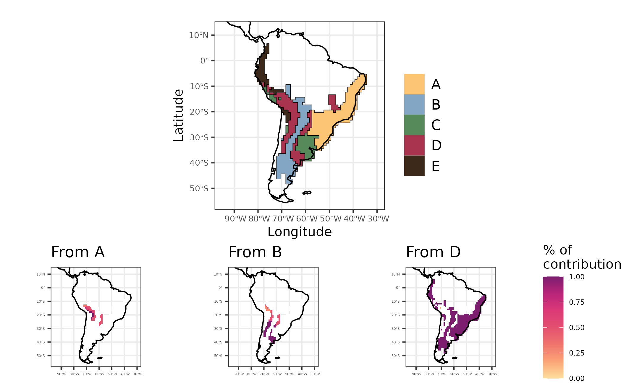
Figure 6 - Maps showing regionalization based on phylogenetic turnover (evoregion - top figure), and the contribution of regions A, B and D to other regions regarding historical dispersal of lineages
Community phylogetic metrics considering in-situ diversification
We also can calculate common metrics of community phylogenetics
considering in-situ diversification dynamics. These community
phylogenetic metrics allows to disentangle the effects of in-situ
diversification from ex-situ in a similar way the in-situ
diversification metric. Namely, PDin-situ and
PEin-situ, they correspond to modified versions of the
classic Phylogenetic Diversity (PD) (Faith, 1998), and PE (Rosauer, et
al.2009), respectively. The difference is that our metrics considers
only the amount of phylogenetic diversity and endemism that emerged
after colonization and establishment of the present day lineages in the
assemblages. For this we use the function
calc_insitu_metrics
akodon_PD_PE_insitu <- calc_insitu_metrics(W = akodon_pa_tree,
                  tree = akodon_newick,
                  ancestral.area = node_area,
                  biogeo = biogeo_area,
                  PD = TRUE,
                  PE = TRUE)
As the other metrics we can plot PDin-situ and PEin-situ in a map. Here we illustrate it by plotting PE and PEin-situ metrics for comparison.
sites <- dplyr::bind_cols(site_xy,
                   site_region =  site_region,
                   age = age_comm$mean_age_per_assemblage,
                   diversification = akodon_diversification$Jetz_harmonic_mean_site,
                   PE = akodon_PD_PE_insitu$PE,
                   PEinsitu = akodon_PD_PE_insitu$PEinsitu,
                   PD = akodon_PD_PE_insitu$PD,
                   PDinsitu = akodon_PD_PE_insitu$PDinsitu)

map_PE <-
   sites %>%
   ggplot2::ggplot() +
   ggplot2::geom_raster(ggplot2::aes(x = LONG, y = LAT, fill = PE)) +
   rcartocolor::scale_fill_carto_c(palette = "SunsetDark",
                                  direction = 1,
                                  limits = c(0, 0.6),  ## max percent overall
                                  breaks = seq(0, 0.6, by = .1)
                                  ) +
   ggplot2::geom_sf(data = coastline, size = 0.4) +
   ggplot2::coord_sf(xlim = map_limits$x, ylim = map_limits$y) +
   ggplot2::ggtitle("A") +
   ggplot2::theme_bw() +
   ggplot2::labs(fill = "PE") +
    ggplot2::guides(fill = guide_colorbar(barheight = unit(2.3, units = "mm"),
                               direction = "horizontal",
                               ticks.colour = "grey20",
                               title.position = "top",
                               label.position = "bottom",
                               title.hjust = 0.5)) +
   ggplot2::theme(
     legend.position = "bottom",
     axis.title = element_blank(),
     legend.text = element_text(size = 7)
   )

map_PEinsitu <-
   sites %>%
   ggplot2::ggplot() +
   ggplot2::geom_raster(ggplot2::aes(x = LONG, y = LAT, fill = PEinsitu)) +
   rcartocolor::scale_fill_carto_c(palette = "SunsetDark",
                                  direction = 1,
                                  limits = c(0, 0.6),  ## max percent overall
                                  breaks = seq(0, 0.6, by = .1)
                                  ) +
   ggplot2::geom_sf(data = coastline, size = 0.4) +
   ggplot2::coord_sf(xlim = map_limits$x, ylim = map_limits$y) +
   ggplot2::ggtitle("B") +
   ggplot2::theme_bw() +
   ggplot2::labs(fill = "PEinsitu") +
    ggplot2::guides(fill = guide_colorbar(barheight = unit(2.3, units = "mm"),
                               direction = "horizontal",
                               ticks.colour = "grey20",
                               title.position = "top",
                               label.position = "bottom",
                               title.hjust = 0.5)) +
   ggplot2::theme(
     legend.position = "bottom",
     axis.title = element_blank(),
     legend.text = element_text(size = 7)
   )

map_PE_all <- map_PE + map_PEinsitu
Figure 7 - Phylogenetic endemism (A), and in situ phylogenetic endemism (B) for Akodon assemblages
Figure 7 shows that the endemism pattern for Akodon assemblages are similar for both metrics, indicating that regions with high endemism are mainly due to in situ diversification process.
Tip-based metrics of trait evolution
Here we will show how to implement three tip-based metrics proposed
by Luza
et al. (2021). Note that these tip-based metrics were estimated
using the stochastic mapping of discrete/categorical traits (diet in the
original publication), but can be extended to other traits as we will
show here. The three tip-based metrics are Transition rates,
Stasis time, and Last transition time, and are
implemented in the function calc_tip_based_trait_evo.
Transition rates indicate how many times the ancestral
character has changed over time. Stasis time indicates the
maximum branch length (time interval) which the current tip-character
was maintained across the whole phylogeny. Finally, last transition
time is the sum of branch lengths from the tip to the
prior/previous node with a reconstructed character equal to current
tip-character. As in the original
publication, we will use the stochastic character mapping on
discrete trait data. This time, however, we will reconstruct the species
foraging strata (Elton Traits’ database, Wilman et al. 2014). We will
reconstruct the foraging strata for 214 sigmodontine rodent species with
trait and phylogenetic data (consensus phylogeny of Upham
et al. 2019).
First we will load trait and phylogenetic data we need to run the
function calc_tip_based_trait_evo.
Now calculate the metrics.
# run `calc_tip_based_trait_evo` function
trans_rates <- Herodotools::calc_tip_based_trait_evo(tree = match_data$phy,
                                   trait = trait , # need to be named to work
                                   nsim = 50,
                                   method = c("transition_rates",
                                              "last_transition_time",
                                              "stasis_time")
                                   )
Since this analysis can take several minutes we can read the result obtained using the same code above
load(system.file("extdata", "transition_rate_res.RData", package = "Herodotools"))Now we have the estimates of the three tip-based metrics for 214 rodent species. We can summarize the tip-based metrics at the assemblage scale. First we will load assemblage and geographic data comprising 1770 grid cells located at the Neotropics.
# load community data
comm_data <- read.table(
   system.file("extdata", "PresAbs_228sp_Neotropical_MainDataBase_Ordenado.txt",
               package = "Herodotools"),
   header = T, sep = "\t"
   )

# load latlong of these communities
geo_data <- read.table(
  system.file("extdata", "Lon-lat-Disparity.txt", package = "Herodotools"),
  header = T, sep = "\t"
  )
Now we calculate the values of tip-based metrics for all species for each assemblage.
# transition rates for each community
averaged_rates <- purrr::map_dfr(1:nrow(comm_data), function (i){
  # across assemblages
  purrr::map_dfr(trans_rates, function (sims) { # across simulations

    # species in the assemblages
    gather_names <- names(comm_data[i,][which(comm_data[i,]>0)]) # get the names
    # subset of rates
    rates <- sims[which(rownames (sims) %in% gather_names),
                   c("prop.transitions",
                     "stasis.time",
                     "last.transition.time")]
    mean_rates <- apply(rates, 2, mean) # and calculate the average
    mean_rates
  }) %>%
    purrr::map(mean)
})
Since the last step take some minutes to complete you can opt to read directly from the package the table with mean values for all metrics
data("averaged_rates")We will represent in space the variation in the tip-based metrics for rodent assemblages. It seems that, in general, assemblages of the southern, western and northeastern Neotropics have species with higher Transition Rates in foraging strata than communities from elsewhere (i.e., they have many species that often changed their foraging strata over time). Assemblage-level Stasis Time was high for two groups of assemblages: one from northeastern Neotropics, and another in central Amazonia. The first group in particular also showed high Transition Rates. Taken together, these results indicate that, despite the frequent changes in foraging strata, the species of northeastern assemblages retained their phenotipic state during more time than the species found elsewhere. Finally, the Last Transition Time metric shows that the transitions leading to the present species foraging strata were older in the i) north of the Amazonia and ii) central Mexico. These results are potentially reflecting i) the location of arrival of ancestral sigmodontine rodents in south America, and ii) the occurrence of several species closely related to basal lineages.
# prepare data to map
data_to_map_wide <- data.frame(geo_data[,c("LONG", "LAT")], averaged_rates)

data_to_map_long <-
  data_to_map_wide %>%
  tidyr::pivot_longer(
    cols = 3:5,
    names_to = "variables",
    values_to = "values"
  )

# create a list with the maps
list_map_transitions <- lapply(unique(data_to_map_long$variables), function(metric){

  plot.title <- switch(
    metric,
    "prop.transitions" = "Transition Rates",
    "stasis.time" = "Stasis Time",
    "last.transition.time" = "Last Transition Time"
  )

  sel_data <-
    data_to_map_long %>%
    dplyr::filter(variables == metric)

  var_range <- range(sel_data$values) %>% round(2)
  var_breaks <- seq(var_range[1], var_range[2], diff(var_range/4)) %>% round(2)

  sig_map_limits <- list(
    x = range(sel_data$LONG),
    y = range(sel_data$LAT)
  )

  ggplot() +
    ggplot2::geom_tile(data = sel_data,
                ggplot2::aes(x = LONG, y = LAT, fill = values)) +
    rcartocolor::scale_fill_carto_c(
      type = "quantitative",
      palette = "SunsetDark",
      na.value = "white",
      limits = var_range,
      breaks = var_breaks
    )+
    ggplot2::geom_sf(data = coastline, size = 0.4) +
    ggplot2::coord_sf(xlim = sig_map_limits$x, ylim = sig_map_limits$y) +
    ggplot2::theme_bw() +
    ggplot2::guides(fill = guide_colorbar(barheight = unit(2.3, units = "mm"),
                                 direction = "horizontal",
                                 ticks.colour = "grey20",
                                 title.position = "top",
                                 label.position = "bottom",
                                 title.hjust = 0.5)) +
    ggplot2::labs(title = plot.title) +
    ggplot2::theme(
      legend.position = "bottom",
      axis.title = element_blank(),
      legend.title = element_blank(),
      legend.text = element_text(size = 7),
      axis.text = element_text(size = 7),
      plot.subtitle = element_text(hjust = 0.5)
    )

})

# Create map
mapTransition_rate <- patchwork::wrap_plots(list_map_transitions) +
  patchwork::plot_annotation(tag_levels = "A")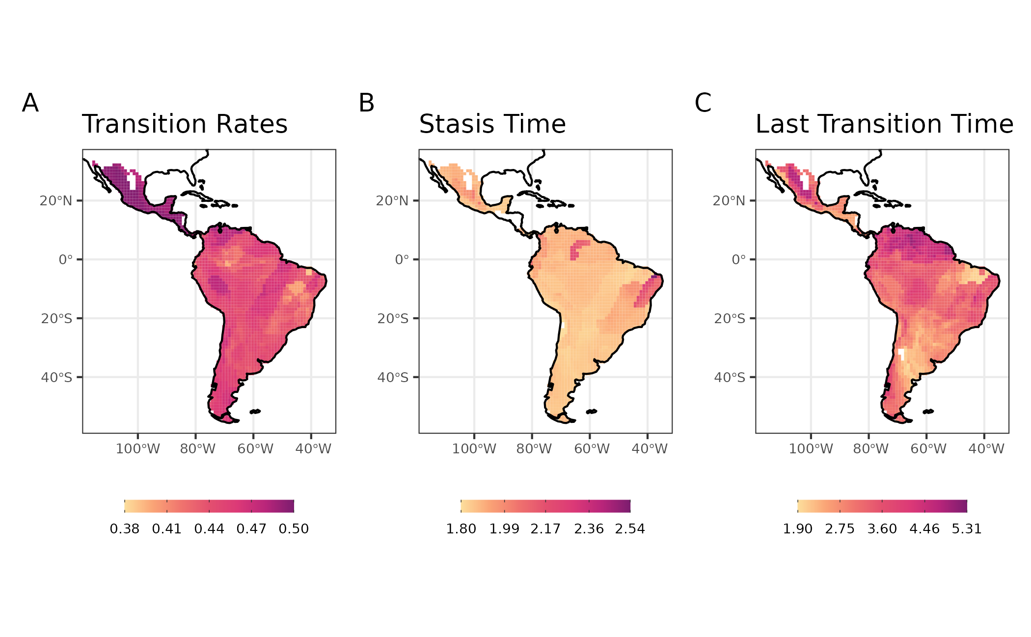
Figure 8: Maps with tip metrics of evolution dynamics of life mode for Sigmodontine species
References
Duarte, L. D. S., Debastiani, V. J., Freitas, A. V. L., & Pillar, V. D. P. (2016). Dissecting phylogenetic fuzzy weighting: theory and application in metacommunity phylogenetics. Methods in Ecology and Evolution, February, 937-946. doi.org/10.1111/2041-210X.12547
Jombart, T., Devillar S., & Ballox, F. (2010). Discriminant analysis of principal components: a new method for the analysis of genetically structured populations. BMC Genomic Data.
Luza, A. L., Maestri, R., Debastiani, V. J., Patterson, B. D., Maria, S., & Leandro, H. (2021). Is evolution faster at ecotones? A test using rates and tempo of diet transitions in Neotropical Sigmodontinae ( Rodentia , Cricetidae ). Ecology and Evolution, December, 18676–18690. https://doi.org/10.1002/ece3.8476
Maestri, R., & Duarte, L. D. S. (2020). Evoregions: Mapping shifts in phylogenetic turnover across biogeographic regions Renan Maestri. Methods in Ecology and Evolution, 2020(August), 1652–1662. https://doi.org/10.1111/2041-210X.13492
Pigot, A. and Etienne, R. (2015). A new dynamic null model for phylogenetic community structure. Ecology Letters, 18(2), 153-163. https://doi.org/10.1111/ele.12395
Van Dijk, A., Nakamura, G., Rodrigues, A. V., Maestri, R., & Duarte, L. (2021b). Imprints of tropical niche conservatism and historical dispersal in the radiation of Tyrannidae (Aves: Passeriformes). Biological Journal of the Linnean Society, 134(1), 57–67. https://doi.org/10.1093/biolinnean/blab079